The more accessible and inclusive your digital product design is, the better its chances of success are. In this article, we explore how inclusive design helps you to cater to more customers and create more revenue for your business.
When designing a best-in-class digital product experience, empathy is a crucial part of the design process. Understanding who your users are, what they’re trying to achieve, and why is essential if you want to build the right product that delivers the right results for everyone involved. But by grouping your target audience solely on their desired outcome, you can miss the chance to create delightful moments that drive conversions.
This is why Inclusive Design is such an important part of great UX design. It forces you to consider the diverse range of different groups from different backgrounds and with varying levels of ability that make up your user base. It helps you to design more memorable and moving experiences that foster long-term loyalty from your customers.
Want to discuss how your business can create a successful digital product with inclusive design?
What is Inclusive Design?
Inclusive Design is an approach that ensures your digital product and experience is accessible and usable by everyone – regardless of their abilities, age, ethnicity, or gender.
It’s not just about adding accessibility features to your app retrospectively to tick off a checklist. Inclusive Design means designing experiences from the outset that are useful, usable, and enjoyable for everyone. To do this, you need a deep understanding of different users with different needs so you can make the necessary accommodations throughout your app.
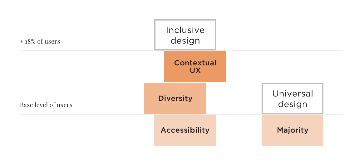
This is what separates Inclusive Design from Universal Design which focuses on building one experience that caters to everyone. Inclusive Design, meanwhile, uses clever interactions and contextual UX to support a diverse range of different users with different needs.
Why Inclusive Design Matters
18% of adults in the UK have a disability of some kind. But designing inclusively doesn’t just benefit those with disabilities. Generally, the more accessible your product is, the better the experience is for everyone.
Strong inclusive design is intuitive and often invisible. Take in-app captions or transcriptions, for example. This feature can be a huge help to those who are deaf or hard of hearing. It allows them to understand the content they’re consuming. But the same feature can also help non-native speakers as well as users who are in noisy environments or prefer to browse silently.
Inclusive design doesn’t detract or distract from your core user experience (UX), it only enhances it for everyone.
Examples of Inclusive Design
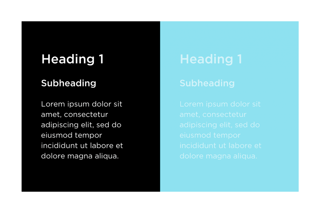
Text Readability and Colour Contrast
To make sure the text in your app is readable by everyone, you need to use the right typeface and create a high contrast with the background. Giving users the option to customise this to be light text on a dark background or “dark mode” as well as the chance to increase the size of the fonts makes it easier for them to achieve the results they’re looking for.
These font sizes should scale up in size in a logical and consistent sequence – the classic progression for this is 12, 14, 16, 18, 20, 24, 30, 36, 48, and 60. Having a consistent structure for the sizing of your text allows your users to scan important information and navigate through your app much faster.
Element Sizing
Size matters. For your users to accurately tap an element in your app, it has to be a certain size. Too small and a certain number of users will miss it – whether they have an impairment or not. This is guaranteed to cause frustration and drive up the amount of time it takes to accomplish what they’re trying to achieve. For many users, this will cause them to give up completely.
Buttons or other visual elements that are tied to the key actions in your app should be large enough that everyone can move quickly and easily through your interface without friction.
Do you want to design your product for success?
Element Spacing
Spacing is one of the most important elements of an accessible digital product. Small differences or discrepancies in spacing around a button or between two rows don’t just have a huge impact on the aesthetic appearance of your app, they can make it far less usable.
Creating a consistent spacing structure with plenty of room between different elements helps users who struggle to tap with accuracy. It also reduces the chances of other users making mistakes when navigating through your app.
Element Placement
Where your elements are placed on the screen has a dramatic effect on how easy your app is to use. The wider apart your key elements are, the longer it takes for users to move through your app and achieve their desired outcomes. The longer it takes, the higher the chance of drop-off and app abandonment.
To help avoid this, elements like your app’s primary navigation should be placed at the bottom of the screen well within reach of users’ thumbs. Similarly, key action buttons such as creating or editing something on the current page should be at the bottom as well.
Photographs and Illustrations
Many default assets, photographs, and illustrations can end up alienating individuals. For example, even generic, minimally designed illustrations with bright non-realistic colours and no skin tone can be interpreted as white being the default.
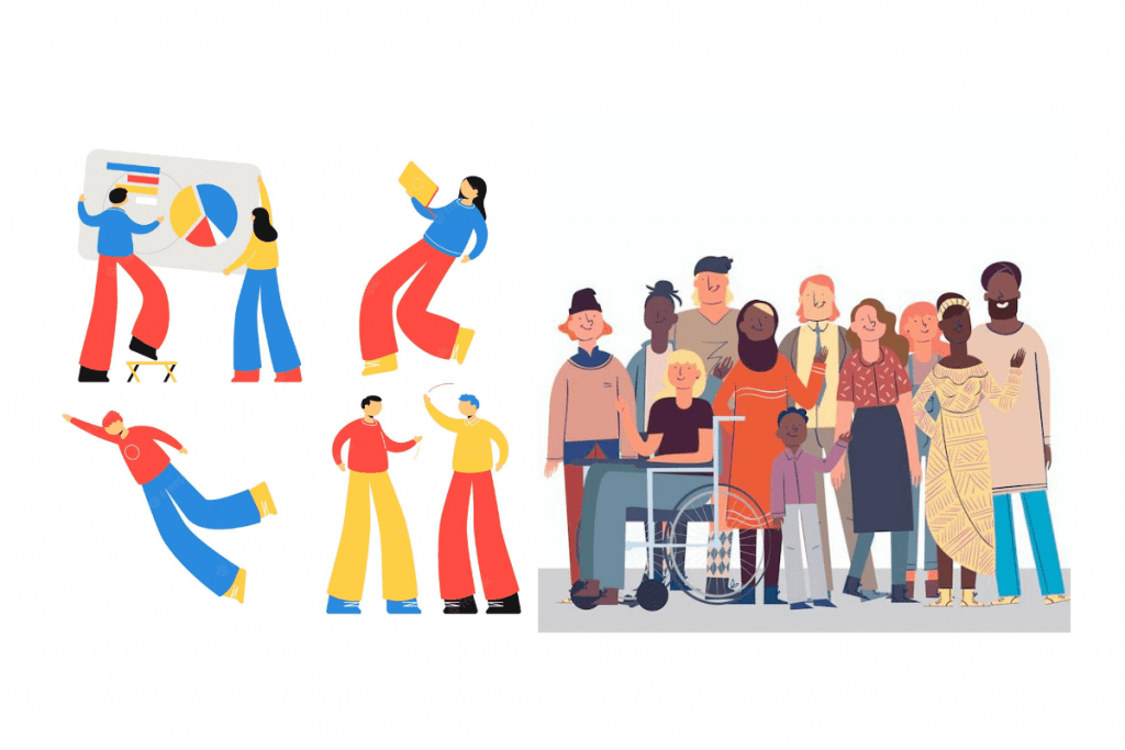
This is a great example of how attempting universal design (designing one thing for everyone) can end up with a product that delights no one. In contrast, many major apps now include diverse illustrations and photographs to represent the diverse populations of people using them.
How We Approach Inclusive Design at Sonin
At Sonin, everything we do goes through thorough accessibility testing to make sure the apps we design are inclusive. We employ reachability heatmaps on every screen to make sure that actions like navigating through the app and completing core tasks can be done quickly and with ease.
We check the contrast between different elements like between the background colour and the text so that all the content in the app is clear and readable. We have guidelines in place for how small any of the in-app text can be to make sure it’s always accessible.
On the other end of the spectrum, we also consider users who have increased the default font size on a device level. This means that the apps we design have to respond to larger font sizes without comprising the core user experience.
Our in-house team of digital product designers test each app’s User Interface (UI) in a number of different lighting environments to make sure the important elements are visible in all situations. And as part of the Product Design QA process, we employ special techniques and tools to replicate various motor and visual impairments.
Making the Business Case for Inclusive Design
Inclusive Design makes your product better and more accessible to everyone. It increases your potential customer base size and creates delightful UX moments that lead to long-term loyalty and more revenue. But it still requires a strong business case along with full buy-in from all your stakeholders.
It’s important that you cover both the moral and legal requirements of making sure your app is accessible. But there’s an even stronger business case for inclusive design in your digital product: extra revenue.
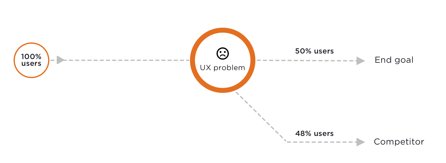
A study found that if they encounter UX problems purchasing goods or services through your app, 50% of your users won’t make the purchase. But that doesn’t mean they will abandon their search. 48% will immediately go looking for an alternative and find a competitor who can offer a better UX.
This means that apps with low or limited accessibility leave money on the table and lots of it. The easier and more inclusive your app is, the more conversions you will create and the more customers you will acquire.
Let’s Build the Right Product, Together.
A poor digital experience can have a huge impact on your return on technology investment. To make sure your product caters to a diverse range of users, you need to consider the user journey from multiple different perspectives.
The best way to do this is to get your key stakeholders in a room together for a Discovery Workshop. There, we work with you to create detailed user personas that help everyone to better empathise with your users, map out the journey they take, and break down the challenges they face along the way.
Following this, we work in focused Design Sprints to solve those challenges using the context we have to design inclusive and innovative solutions that delight your users and deliver the business results you need.