TL;DR: Average screen sizes have been increasing year-on-year for ages. But the way we’re interacting with them hasn’t. 1 out of every 2 users still holds their phone in one hand, using their thumb for navigation. Why then, do so many apps insist on putting key components as far out of reach as possible?
In the super-sized screen era, reachability is an essential part of good UX/UI design.
The very first Android phone had a 3.2-inch display. Today, my S10+ has more than double the real-estate. But I have to admit, nine months on, the sizeable screen that played a huge part in my purchase decision isn’t without its drawbacks.
Mo Screen. Mo Problems.
Most importantly, as someone who holds their phone in my right hand, trying to tap a typical hamburger menu icon without using my left-hand feels like fighting someone in a thumb war.
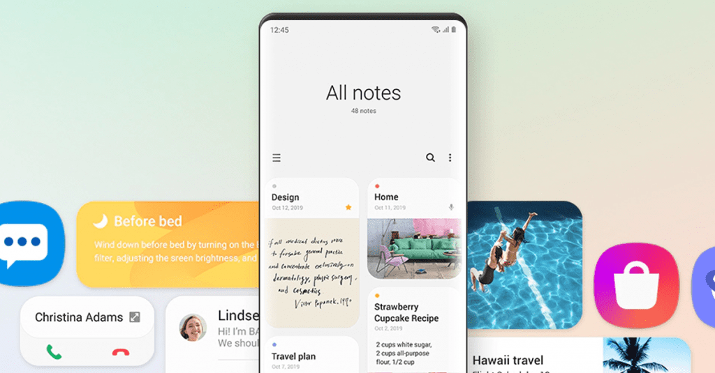
The same cannot be said, however, when I jump into my phone’s settings. Why? Because Samsung’s One UI does something revolutionary, groundbreaking and truly audacious…
…It puts the components I want where I can reach them.
Alright, this may not be the most exciting advancement in UX/UI app design. But just because phone form factors are getting bigger and bigger, it doesn’t mean the way we use them is changing. 49% of users, myself included, still hold their phone in one hand and use their thumb to navigate.
Reachability Workarounds.
Back in 2014, Apple added a solution to this growing problem. With a double-tap, you could move the whole screen downwards to bring high-up components into reach. The problem? Pick one, there were many.
The top of the screen changed to an ugly black block. And although this has recently been changed to a more aesthetically pleasing blurred background, the whole thing resets itself after the user carries out just one action.
At best, it’s an awkward workaround. But at its worst, when it’s a commonly-used component, it’s frustrating. Badly positioned on-screen elements make for a friction-filled user experience. They’ll drive up your app abandonment rate, hurt your ROI and damage your revenue.
The solution? Design with reachability in mind. It sounds simple but even today there are so many apps that still miss the mark.
My personal pet peeve? URL/search bars in web browsers. Safari, Chrome and Firefox are all top-driven designs, putting one of the most important elements the furthest out of reach.
Why? Just why?
Designing with Reachability in Mind.
At Sonin, we use reachability heatmaps for every single app we design. During wireframing, these heatmaps sit over the top as a transparent layer.
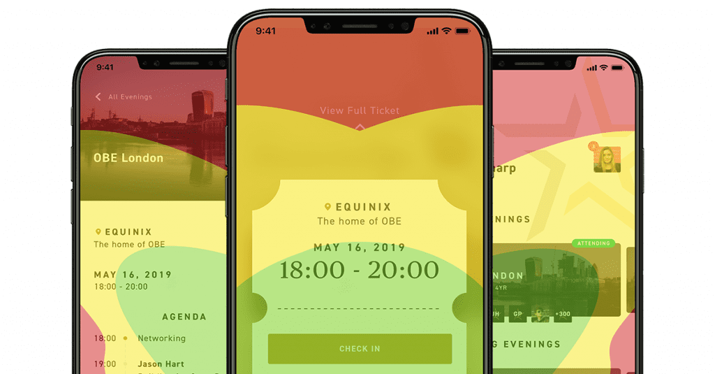
This way, we make sure the most important components are always in the most easy-to-reach places. This makes the most common and important actions easier, helping every user to achieve their desired outcome much, much faster.
Keep In Mind.
It’s important to keep in mind that reachability changes from phone to phone and from user to user. That’s why thorough user research is so essential.
Any time a new flagship phone enters the market, we’re the first to test it with real-world users. Based on this, we build custom reachability maps for each form factor.
At the beginning of any project, we do the same for the different user groups within the target audience. That way, we’re able to build up reachability maps for specific user segments and customer demographics.
This has proven to be invaluable to our award-winning digital product design process.
Final Thoughts.
Screen sizes are changing. UX and UI design must change too. Users may not consciously consider the reachability of your app components, but they sure know a frustrating experience when they see it.
Delight your users, drive engagement and increase retention. Design around research-backed reachability heatmaps.