Challenger banks aren’t challenging anymore. Monzo has 9 million UK customers. Revolut is valued at over $45 billion and operates across 38 countries. Starling is profitable. These aren’t scrappy startups disrupting from the margins, they’re established players with market share, regulatory obligations, and in some cases, their own legacy infrastructure starting to accumulate.
But the lessons they delivered to financial services over the past decade remain underapplied. Most traditional banks and insurers know what good mobile UX looks like, they’ve seen it. The harder question is why the gap persists, and what actually closing it requires.
This piece focuses on what the leading challengers got right, what made it possible, and what firms working through digital investment decisions should take from it in 2026.
Monzo: Real-Time Transparency as a Trust Mechanism
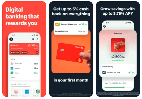
Monzo’s early growth wasn’t driven by advertising. It was driven by referrals from people who finally felt in control of their money. The product mechanics behind that are straightforward: instant push notifications on every transaction, real-time balance updates, one-tap card freezing, and spending categorised automatically without any user effort.
None of those features are technically complex. What made them valuable was the decision to prioritise them, to treat transparency as a product feature rather than a nice-to-have. Customers who can see their money moving in real time develop a fundamentally different relationship with a financial institution. They trust it more. They churn less. They tell people.
Monzo also moved faster on product firsts than most expected: it was the first UK mobile bank to launch joint accounts with a fully digital application process, and one of the earliest to offer Apple Pay integration. Speed of iteration, not just feature quality, was part of the model.
Starling Bank: The Current Account as Platform
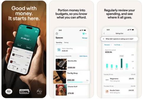
Starling’s strategic bet was that the current account is the most valuable real estate in a customer’s financial life, and that whoever controls it controls the relationship. The Marketplace model followed that logic: rather than building every financial product itself, Starling opened its app to third-party integrations across insurance, savings, mortgages, and pensions.
The result is an app that can genuinely serve as a customer’s financial hub rather than a single-product interface. For business customers especially, this proved compelling. Starling built dedicated features for sole traders and SMEs that larger banks consistently underserved.
Five consecutive Moneywise awards for Best British Bank reflect what happens when a financial institution treats its app as a living platform rather than a static product. The lesson for established firms isn’t to replicate the Marketplace verbatim, it’s to ask which partnerships and integrations would make your app more central to your customers’ financial lives.
Revolut: Engagement as a Business Model
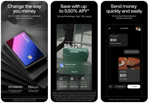
Revolut’s product decisions make most sense through the lens of engagement frequency. Most financial apps are opened a handful of times a month. Revolut is opened daily by a significant portion of its user base, because there’s always something to look at, something to do, something to act on.
Spending analytics that update in real time. Savings vaults that can be set up in under a minute. Cryptocurrency and stock trading alongside everyday banking. Budgeting tools that surface insights without being asked. The app is designed to generate habitual use, and habitual use generates upsell opportunities, referral behaviour, and reduced churn.
Revolut now has over 50 million customers globally. The engagement model, treating the financial app as something people want to use, not just need to use, is central to how it got there.
Wise: Transparency as a Pricing Strategy
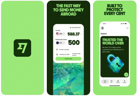
Wise (formerly TransferWise) belongs in this conversation because it solved a problem that traditional banks had decided customers would just accept: opaque international transfer fees. Wise made the real exchange rate and the exact fee visible before every transaction. Not buried in small print, front and centre, before you commit.
That single design decision, radical fee transparency, built a brand. Customers who feel they’re not being caught out become advocates. Wise now processes over £10 billion in cross-border transactions every month, largely because it made honesty about cost a product feature rather than a liability.
For any financial services firm with a pricing model that customers find confusing or opaque, the Wise story is instructive. Transparency isn’t just ethically preferable, it’s commercially advantageous.
What Established Institutions Should Actually Do
The honest assessment is that the gap between challenger UX and legacy UX is not mainly a technology gap. The technology to build real-time notifications, instant self-service, and personalised insights exists and is accessible. The gap is a prioritisation one, specifically the difficulty of balancing customer experience improvements with the operational demands of running a large, regulated institution.
That’s a genuine constraint, not an excuse. But it does suggest where to focus:
Platform thinking. Ask which third-party products or integrations would make your app more central to your customers’ financial lives. The institution whose app becomes the hub wins the primary relationship.
Real-time feedback. Every transaction, balance change, and account event should surface immediately in-app or via push. Customers who can’t see their money moving lose confidence in the institution holding it.
Meaningful personalisation. Use the data you already hold. Surface relevant insights, upcoming bill spikes, unusual spending, product recommendations based on actual behaviour, without asking the customer to configure anything.
Frictionless self-service. If freezing a card, updating an address, or opening a savings account takes more than two minutes without speaking to someone, that’s a retention risk that compounds over time.
Where to Start
The most common mistake in financial services app modernisation is trying to fix everything at once. Challenger banks didn’t launch perfect products, they launched focused ones and iterated quickly based on real user feedback.
A more effective approach is to identify one high-value, visible improvement, a real-time notification system, a self-service card management tool, a spending insights module, build it properly, prove the model, and then expand. This creates internal momentum, generates usable data, and de-risks the broader investment.
It’s also worth noting that the challengers who got this right are now facing a new set of problems, the complexities that come with scale, regulation, and their own growing infrastructure. That story is worth understanding, too, because it changes what ‘catching up’ actually means.
If you’re working through what a modernisation programme for your financial services product looks like, we’re happy to talk it through. Sonin’s Lighthouse Projects approach is designed specifically for firms that want to move quickly without betting on a multi-year transformation.