Every ping, prompt, and push has an emotional impact.
A great experience with a digital product goes far beyond great visuals and intuitive navigation as another layer is becoming increasingly impossible to ignore: how a product makes users feel.
The hand-off moment when a user downloads your app is the beginning of a relationship. It lives in their pocket, buzzes in their downtime and cuts through their concentration. Being mindful of that isn’t enough anymore. We must be intentional.
In this article, we discuss how to design experiences that prioritise user wellbeing by integrating ethical UX practices, calm tech principles and psychological awareness at every stage, and prove why mental health should be built into every product, not bolted on after.
The Psychological Toll of Digital Overload
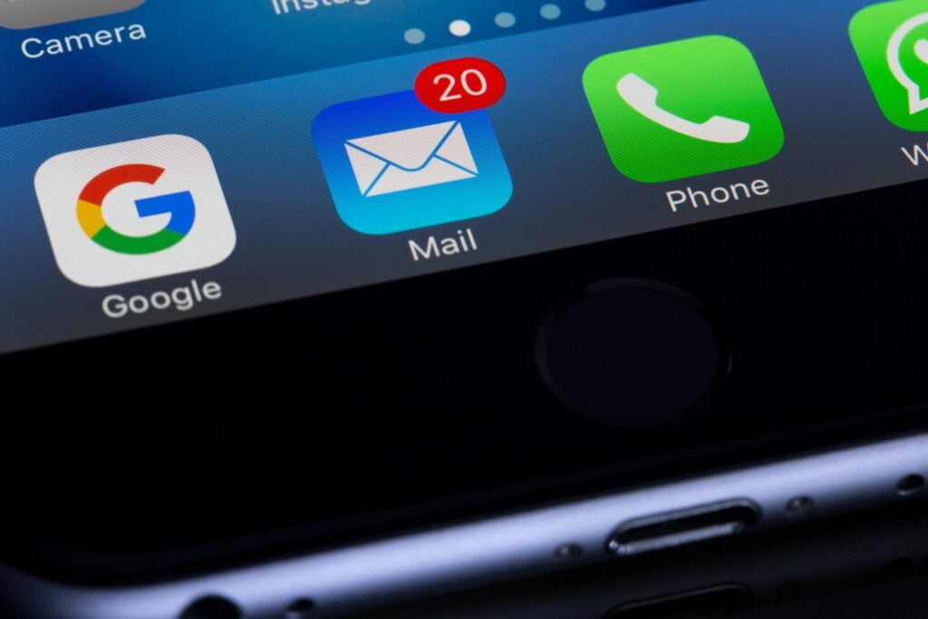
We’ve all felt it: the flood of notifications, pings, and banners. While each one seems small, they create a hum of background stress together. The Zeigarnik Effect shows our brains cling to incomplete tasks, so every unread message or lingering alert adds to mental noise.
Here’s the “aha” moment: we don’t just hear notifications — we carry them.
Mainstream productivity tools are a common culprit. Intended to help, they often overwhelm, stuffed with reminders, overdue badges and guilt-laced nudges. You open the app to feel in control but it becomes anxiety-inducing when overstuffed with features and reminders. A 2023 Asana report found that 70% of knowledge workers experience burnout, often tied to work management tools themselves.
“70% of knowledge workers experience burnout, often tied to work management tools themselves.”
Asana, 2023 Study
That emotional fallout adds up. According to the APA, 44% of people check their phones too much, and nearly 1 in 5 report stress from tech use. If your app adds pressure — even unintentionally — you risk being part of the problem.
At Sonin, we always ask, “What does this mean for the user?” because let’s not forget that your app isn’t the only one users interact with. When everyone’s competing for attention, notification fatigue and cognitive overload quickly follow. Even something as well-intentioned as a sales push (“20% off today!”) can have a negative mental impact when a user is already facing financial stress.
That’s why we always ask: “What does this mean for the user?”
It’s a simple question that underpins our approach to building the right product — and the right experience. Many apps fail to consider the emotional cost of constant connection.
In short, poor design doesn’t just create friction. It creates frustration. And that leads to churn.
Calm Tech and Ethical Nudges
Designing ethically isn’t about doing less. It’s about doing better.
It means asking more profound questions. What might your users be going through today? Where could friction create stress? What’s a feature’s emotional impact?
This mindset shift leads to smarter, more considered decisions, especially regarding notifications, interactions and choices. Enter Calm Technology.
Coined by tech anthropologist Amber Case, Calm Tech is about creating products that inform without overwhelming. It respects the user’s attention, blending into the background when unnecessary. As Case puts it, “The most potentially interesting technologies are those that disappear.”
Ethical nudges build on this idea. Where dark patterns manipulate, ethical nudges empower.
Examples:
- A transparent opt-in for marketing updates rather than hiding it behind a pre-ticked checkbox.
- A gentle reminder after inactivity rather than a series of guilt-tripping push notifications.
When you build trust through clarity, you strengthen long-term engagement. You’re not pushing — you’re partnering.
Designing with Empathy: Reducing Mental Load
Thoughtful UX reduces cognitive strain. That’s not just good design — it’s good psychology.
Cognitive load theory tells us that our working memory has a limited capacity. The more decisions, options, or steps we cram in, the more mental effort we demand. This leads to fatigue, frustration and drop-off.
“Too much, too soon overwhelms users”
That’s why every decision matters – from the number of onboarding screens to the default settings. Here’s how we reduce mental load in real terms:
- Fewer steps: Make the journey from A to B seamless.
- Better defaults: Pre-fill information or guide users with smart assumptions.
- Clearer language: Replace jargon with clarity.
Pacing is equally important. Too much, too soon overwhelms users. Give them time to explore at their own speed. The best apps scale with the user—they don’t rush them.
Onboarding is a critical opportunity. If done well, it sets the tone for the relationship. Done poorly, it becomes a barrier. But beware of the sunk cost fallacy — if a user sticks with your product because they’ve already invested time (not because it meets their needs), you risk losing trust. Thoughtful onboarding supports, not traps.
“Onboarding is a critical opportunity. If done well, it sets the tone for the relationship.”
Mental Health as a Product Strategy — and a Business Imperative
Mental health shouldn’t be siloed to wellness or meditation apps. Whether you’re building a fintech tool, internal dashboard or e-commerce platform, your product impacts the mental state of its users. And in a world where attention is currency, how your product makes people feel is just as important as what it does.
It’s not a question of if your product affects mental wellbeing — it’s how, and whether that impact is considered or accidental.
At Sonin, we believe that designing for mental wellness is just as much a strategic priority as accessibility, performance, or scalability. It’s core to building the right product that supports users, respects their attention and fosters long-term engagement.
Why Feelings Are a Feature
Modern psychology tells us that user decisions are driven far more by emotion than logic. Cognitive biases like loss aversion, the sunk cost fallacy and decision fatigue shape how people interact with your app. If your interface creates uncertainty, pressure or information overload, users will feel it and react emotionally.
A study from Nielsen Norman Group found that interfaces that reduce cognitive effort are consistently rated as more trustworthy and satisfying, even when functionality is equal.
So, how do you shift from reactive to proactive regarding wellbeing?

Strategic Guidance for Product Teams
If you’re a product owner, CTO or digital lead, here’s how to embed mental wellness into your development roadmap — practically and strategically.
1. Audit for Emotional Friction
Walk through your experience from a real user’s perspective — not just what they do but how they might feel at each step. Where might they feel rushed, confused, pressured, or drained?
Ask:
- Where are we adding complexity that could be simplified?
- Are our alerts timely — or just noisy?
- Would I want to interact with this on a stressful day?
2. Reframe Notifications
Every push, ping, or prompt is a psychological micro-interaction. Done wrong, they distract. Done right, they empower.
Instead of:
“You haven’t logged in for a while — come back!”
Try:
“We’ve saved your progress — pick up where you left off when you’re ready.”
Treat notifications as invitations, not interruptions.
3. Embrace Humane Design
Make empathy a principle, not a nice-to-have. Create internal guidelines ensuring your team considers the user’s emotional experience. This directly aligns with Sonin’s core values:
- We Understand: Our users’ challenges, contexts, and emotions.
- We Care: About outcomes, not just outputs.
- We Never Stop Thinking: About how to improve, ethically and intentionally.
4. Build Feedback Loops for Wellbeing
Are your users showing signs of fatigue, frustration, or disengagement? Look for:
- Drop-off after specific interactions
- Rapid tap patterns (a signal of confusion)
- High opt-out rates on notifications or in-app messages
Use this data not to drive users harder but to improve the experience for their wellbeing.
5. Prioritise the Right Metrics
Session length alone doesn’t tell whether your users are satisfied or simply stuck. Include wellbeing-focused KPIs such as:
- Task success rate
- User confidence scores
- Subjective satisfaction (collected post-interaction)
Sometimes, less time in your app indicates that you did your job well.
6. Create a Wellbeing QA Checklist
Make mental wellness part of your QA process. For every feature, ask:
- Is this respectful or manipulative?
- Does this empower the user or pressure them?
- Is this clear or does it rely on ambiguity?
- Would this feel good on someone’s worst day?
By designing with wellbeing in mind, you don’t just reduce churn or improve retention—you build trust, foster long-term relationships and create advocates, not just users.
We’ve supported businesses across sectors—from finance to property to healthcare—in rethinking how their products serve people, not just processes. By doing this, you foster long-term relationships and create advocates, not just users.
Because the best products don’t just work well.
They feel good to use.